Diary for 01:090:101:21, Experimental Math, fall 2008
The
nineth meeting, 11/3/2008
Most students who take a math course in college will take some sort of
calculus course. Just look at the Rutgers course schedules -- the Math
Department's dominating teaching activity is calculus. Calculus is about the theory and
applications of derivative and integral. I'd like to
draw some pictures and help you understand one of these words. And
experimentation will reveal that things are not as they seem, both
theoretically and practically.
A random (polynomial) example
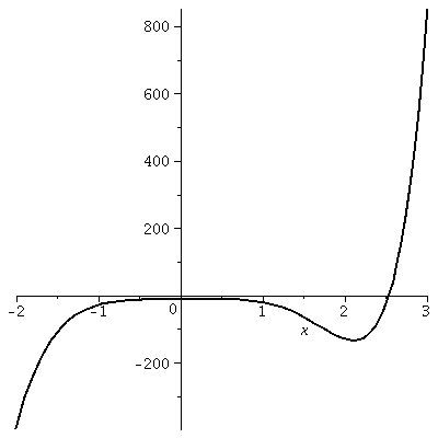
Consider the function which is defined by this equation:
f(x)=x7-17x4+5x2+3x-12
Let's look at some simple graphs of y=f(x).
|
plot(f(x),x=-2..3,thickness=2,color=black);
The graph on [-2,3]
I made the thickness larger (the default is 1) so I could see it
better and I made the color of the curve black because that seemed
saner (?) than red, which is what's used if no color is specified.
|
|
|
We will now "zoom in" on this curve. The Maple software when given an interval
automatically (unless you advise it otherwise!) tries to recenter the
graph and to use the window supplied as well as possible. So if a
horizontal interval is given, the appropriate vertical interval is
taken to show the function's graph as well as possible. |
|
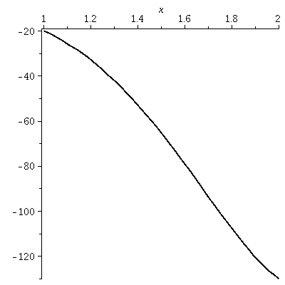
plot(f(x),x=1..2,thickness=2,color=black);
The graph on [1,2]
Probably you can see where this graph came from on the picture
above. It retains a slight amount of curviness.
|
|
|
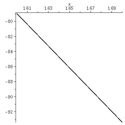
plot(f(x),x=1.6..1.7,thickness=2,color=black);
The graph on [1.6,1.7]
Now something interesting is happening because of the simplicity
shown. We have zoomed in again. To me there is still a slight bend in
the curve but the picture is closer to a straight line.
|
|
|
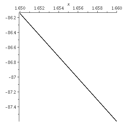
plot(f(x),x=1.65..1.66,thickness=2,color=black);
The graph on [1.65,1.55]
Again we go in. To me what's shown is visually
indistinguishable from a straight line. Further zooming, which you can
try, doesn't lead to pictures which are different from what's shown
here.
|
|
Local linearity
With the help of the machine, we can see that under a suitable
"microscope" the graph becomes a straight line. Sometimes people say
that the graph is locally linear. The word "locally" means a heck of a
lot of magnification, of course. The slope of the line shown is called
the derivative. If you give me almost any function defined by a
formula using familiar "things" then, with sufficient magnification,
the graph will change into a line.
Lots of magnifications for nice functions yield straight lines. That
is the idea behind a whole bunch of calculus. It is remarkable that
these properties of functions were deduced historically with much less
evidence then what can be generated with Maple in a short time. This is remarkable. But
let's try another example.
Absolute value
I want to graph a function that is familiar but probably not
admired by many, especially those who meet it and are annoyed by it in
algebra. The function is absolute value, and the absolute value
of x is usually written |x|. The official definition of |x| is
clumsy. Here is it is: x if x≥0
|x| =
-x if x<0
|
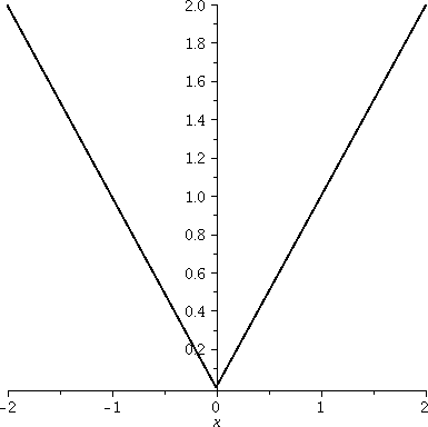 plot(|x|,x=-2..2,thickness=2,color=black);
The graph on [-2,2]
Some of the irritations of Maple's
graphs are visible here. Maybe they are not irritations -- they are
features. Let's see: first, the corner of |x| seems to be
floating above the horizontal axis and doesn't go through (0,0). If
you look critically at the graph, though, you will see that the corner
is at (0,0). The horizontal line is slightly below
y=0. But there's another, more subtle "error". The aspect ratio of the
graph is wrong, and the tilt of the lines is wrong. The graph is 4
units wide and only 2 units high. (Aspect ratio is the way horizontal
and vertical units are related.) The x and -x parts of the graph
should have slope equal to 1 and -1, and the slopes shown don't seem
to be these quantities (for example, the rays should be perpendicular
to each other, which is not how they are displayed). This is the
default view for graphs produced by Maple. It is called unconstrained scaling. We can fix this if we
wish.
|
plot(|x|,x=-2..2,thickness=2,color=black,scaling=constrained);
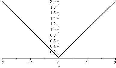 The graph on [-2,2] again
You can make the option scaling=constrained part of the command or it
can be changed by clicking on the mouse when the cursor is over the
image. The angles and aspect ratio are now displayed "exactly".
|
plot(|x|,x=-.005..(.005),thickness=2,color=black,scaling=constrained);
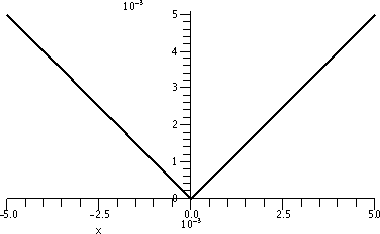 The graph on [-.005,.005]
Would I lie to you? This really, really, really is the Maple graph of |x| on a tiny interval centered
around 0. It surely is not becoming a straight line. It surely
does not seem to be different -- in fact, it seems to be
self-similar, and the corner here matches up with the corner in
the previous graph.
|
Not locally linear!
The absolute value function is not locally linear. There is no
magnification which will straighten it out around (0,0). For those of
you who haven't taken a calculus course (and you should check with
those who have!) note that this awkwardness is handled in such courses
by just throwing out the function. Don't think about
it!
Let's make things a bit worse. Here are more pictures.
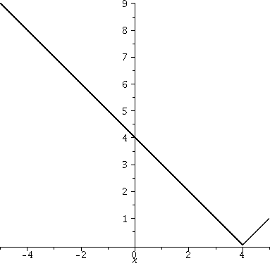
|
Here is a graph of |x–4| on the interval [-5,5]. The "–4"
moves the corner to the right. That – moves the picture
right has always been slightly irritating to me. That's the way
it is, though.
|
|
|
|
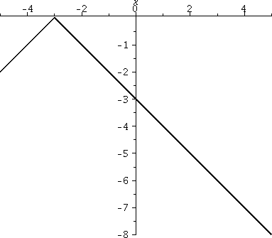
Here is a graph of –|x+3| on [-5,5]. Now the corner has
been moved to the left, and is at -3. The –, the minus sign in
front, causes the corner to open in the negative y direction: the graph is flipped over the y-axis.
|
|
|
|
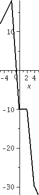
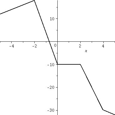
Now let me consider a more complicated function, which is a sum of
multiples of "moved" absolute values. After all, polynomials are a sum
of multiples of powers of x. This function is
4|x-4|-5|x-2|+7|x|-8|x+2|.
|
|
Constrained
To the right is a picture of the graph in constrained mode: the "truth". Maybe this, while
true, is not very informative. Here the domain is [-5,5] again, and
the range of the graph is from less than -30 to almost 20 (I learn
this by looking at the numbers on the vertical axis). So the aspect
ratio of this true view is 5 to 1! I find this graph difficult
to learn much from. It seems squeezed.
|
|
|
|
Unconstrained
Now the graph is displayed "unconstrained", and although maybe the
angles are not accurate, at least we can see more clearly some of the
other qualitative aspects of the graph. To the right is a picture of
the graph in unconstrained mode. Here
the graph has been widened, so there is a distortion. But now ...
I hope you can see that there are 4 corners, and I bet that the
function can't be "locally linearized" at those 4 points. You'd better
not study this function in calculus -- it isn't nice.
|
|
|
Where do you see such graphs? Not in a calculus course -- they are
horrible and strange and hard to think about. But you will see them in
almost any daily newpaper and on lots of web pages, when financial
markets report prices.
History
In 1827, the biologist Robert Brown microscopically observed the
motion of pollen in water. The pollen seemed to jump bizarrely, in
strange and jagged paths, very different from the smooth motion of,
say, a cannon ball in a parabolic trajectory. Observation of dust
particles gave the same sort of results, so the motion couldn't be
attributed to some sort of life-force in the pollen grains. This
movement of the particles was named Brownian motion. The
doctoral thesis of Bachelier in 1900 connected Brownian motion with
variations in stock and option markets. Such jagged graphs typically
appear in many financial reports. One of Einstein's famous results of
1905 explained Brownian motion using probability -- the particles of
dust move as a result of random molecular collisions, and the
molecules move because of heat.
Links
The paths typically are not smooth curves, and are usually
not differentiable! There is no magnification which will make
these curves appear locally like straight lines. The functions
involved are not locally linear. There is a sort of self-similarity,
though, because when the paths are magnified, more roughness appears
and the smaller scale views seem as bad as the large-scale view. For
more discussion, here is some
history and intuitive metaphor. Here is a
very clever moving applet (?) which may make the idea of Brownian
motion clearer. You may need to look at it for a while to understand
what's being shown.
In the last 20 or 30 years, Brownian motion and related topics have
been extensively studied by mathematicians and physicists, and
non-differentiable functions are standard tools in mathematical
finance and other areas!
Much more interesting behavior can occur, and displaying some of this
behavior to you is my goal today. I will try to build the display
gradually. Please realize that the functions and graphs you have
looked at in most of your courses are actually very special -- indeed,
most functions are much more like what I'm about to describe than all
of the so-called standard functions of calculus. We will go
step-by-step.
round
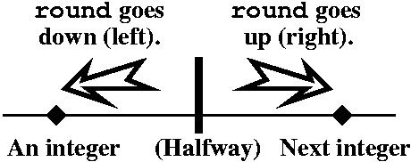 Maple has a built-in function called
round. Probably you can tell me what
round does if I show you some values:
Maple has a built-in function called
round. Probably you can tell me what
round does if I show you some values:
round(.9)=1 round(1.2)=1 round(.2)=0
And a few negative (?) values:
round(-.3)=0 round(-1.7)=-2
The picture to the right is supposed to help you understand what
round does.
|
The sawtooth function
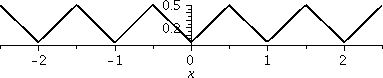 round(x) computes the nearest integer to
x. We can create the sawtooth function with round(x). To the left is a graph of |round(x)-x|. The graph shows you why this is
called the sawtooth function. This function has many real applications
in engineering, but I want to "appreciate" the picture and try to
explain it. Since round(x) gets the closest integer, and a number
can't be any farther away from the closest integer than 1/2, the value
of this function is between 0 and 1/2. Also, the function is always
positive because of the outer absolute value. It gives the distance to
the nearest integer, and repeats itself in every integer interval, so
from now on I'll only show graphs in the interval [0,1]. The other
intervals repeat this picture. Some of these pictures will be
difficult to understand, or you will want to deny they exist. That's
o.k.: many 19th century mathematicians and physicists had
the same feelings.
round(x) computes the nearest integer to
x. We can create the sawtooth function with round(x). To the left is a graph of |round(x)-x|. The graph shows you why this is
called the sawtooth function. This function has many real applications
in engineering, but I want to "appreciate" the picture and try to
explain it. Since round(x) gets the closest integer, and a number
can't be any farther away from the closest integer than 1/2, the value
of this function is between 0 and 1/2. Also, the function is always
positive because of the outer absolute value. It gives the distance to
the nearest integer, and repeats itself in every integer interval, so
from now on I'll only show graphs in the interval [0,1]. The other
intervals repeat this picture. Some of these pictures will be
difficult to understand, or you will want to deny they exist. That's
o.k.: many 19th century mathematicians and physicists had
the same feelings.
|
 > st:=x->|round(x)-x|;
|
|
This defines the sawtooth function as st
so that we can refer to it more easily.
|
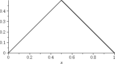
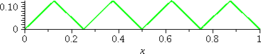
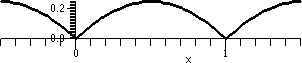
To the right is a plot of st. The
horizontal scale of the graph is [0,1] and the vertical scale, [0,.5].
These options were specified:
color=black,
thickness=2,
scaling=constrained
|
 This is a graph of (1/2)st(2x). The horizontal scale of the
graph is [0,1] and the vertical scale, [0,.25].
This is a graph of (1/2)st(2x). The horizontal scale of the
graph is [0,1] and the vertical scale, [0,.25].
|
 This is a graph of (1/4)st(4x). The
horizontal scale of the graph is [0,1] and the vertical scale, [0,.125]. 4 is 22.
This is a graph of (1/4)st(4x). The
horizontal scale of the graph is [0,1] and the vertical scale, [0,.125]. 4 is 22.
|
 This is a graph of (1/8)st(8x). The horizontal scale
of the graph is [0,1] and the vertical scale, [0,.0625]. 8 is
23.
This is a graph of (1/8)st(8x). The horizontal scale
of the graph is [0,1] and the vertical scale, [0,.0625]. 8 is
23.
|
|
Now comes the real thing. Graphs of several functions are displayed together. We are adding up what was shown before.
|
st(x) is in black.
st(x)+(1/2)st(2x) is in green.
st(x)+(1/2)st(2x)+(1/4)st(4x) is in blue.
st(x)+(1/2)st(2x)+(1/4)st(4x)+(1/8)st(8x) is in red.
| 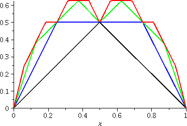 |
|
Name and graph
These sums are all approximations of what's called the Takagi
function, named after a Japanese mathematician (more
historical information is below). So let me jump more deeply and
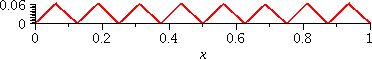
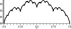
display a graph of add((1/2^j)*st((2^j)*x),j=0..10),x=0..1)
and tell you that this sum is the first 10 terms (no, 11, sorry!) of the Takagi
function.
|  |
Here are some more pictures. I chose the interval [.362,.363] as a
fairly random interval and I would like to investigate what happens
"microscopically" there. I also defined
T:=(x,n)->add((2^(-j))*st((2^j)*x),j=0..n);
so that I could write the plotting instructions more easily.
Looking at one approximation of the Takagi graph on a small
interval
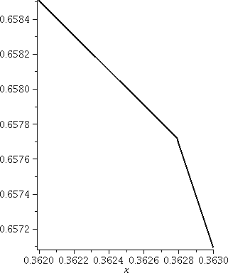 To the right is a graph of T(x,10) on the interval [.362,.363]. On
the big scale of the whole unit interval, with the picture shown
above, the function looked curvy. Here the length of the interval is
.001, and you can "see" a corner. The sum for T(x,10) adds up terms
which steadily get smaller, and the smallest has bumps which are
2-10≈.0098, about the same size. So perhaps we should
not be surprized we see a corner. But Mr. Takagi wants us to add up
more terms, more and more and more terms!
To the right is a graph of T(x,10) on the interval [.362,.363]. On
the big scale of the whole unit interval, with the picture shown
above, the function looked curvy. Here the length of the interval is
.001, and you can "see" a corner. The sum for T(x,10) adds up terms
which steadily get smaller, and the smallest has bumps which are
2-10≈.0098, about the same size. So perhaps we should
not be surprized we see a corner. But Mr. Takagi wants us to add up
more terms, more and more and more terms!
|
|
A closer approximation of the Takagi function on this tiny
interval
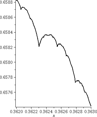 Here is a graph of T(x,20) on the interval [.362,.363]. Now we've
made the terms and the sawtooths smaller. The scale of the last term
is 2-20≈.000001, and this is one-thousandth the width
of the window we contemplate to the right. There are lots of corners
in this window.
Here is a graph of T(x,20) on the interval [.362,.363]. Now we've
made the terms and the sawtooths smaller. The scale of the last term
is 2-20≈.000001, and this is one-thousandth the width
of the window we contemplate to the right. There are lots of corners
in this window.
You can continue to play with zooming and with adding up more
terms. Now I will tell the entire story.
|
The Takagi function and its graph
Here is the official definition of the "whole" Takagi function.
T(x)=st(x)+(1/2)st(2x)+(1/4)st(4x)+(1/8)st(8x)+ and so on ...
From the point of view of modeling and understanding Brownian motion
and other real phenomena, the phrase "and so on ..." is probably the
most important part of the definition. We add up infinitely
many successively smaller sawtooth functions. There are bumps
being placed everywhere so that no matter how much you magnify
the graph, there will be no local linearity showing at any
point of the graph. This function, in the language of calculus, is
not differentiable at every point: terrible, terrible,
terrible. That it happens to be a better model of reality for many
situations than polynomials, which are much beloved and computed, is
perhaps more a statement about human culture.
 The graph of the Takagi function is what's called a fractal. The
definition of this word is imprecise (please look at the link given
for extensive discussion and a large variety of examples). Most
definitions of fractals include some kind of
self-similarity. This means that the object looks the same at
different scales or magnifications. The graph of the Takagi function
has a sort of self-similarity.
The graph of the Takagi function is what's called a fractal. The
definition of this word is imprecise (please look at the link given
for extensive discussion and a large variety of examples). Most
definitions of fractals include some kind of
self-similarity. This means that the object looks the same at
different scales or magnifications. The graph of the Takagi function
has a sort of self-similarity.
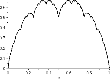
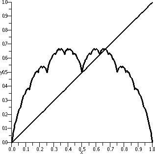
To the right is a graph of an approximation (of course since I don't
have time to wait for a computer to add up an infinite number of
terms!) of the Takagi function. There is also a straight line shown:
y=x. In the first half of the interval, for x between 0 and .5, the
difference between the line and the Takagi function is
precisely similar to the graph of the Takagi function on [0,1].
|
Pictures of this self-similarity
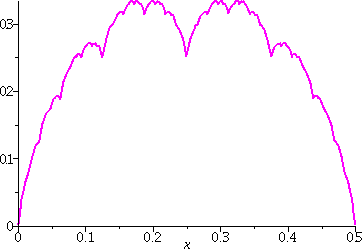
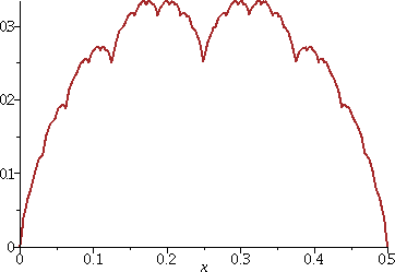
Here is a display the self-similarity just mentioned. Below there
are graphs of two different functions on the interval
[0,.5]. On the left, in magenta, is
T(x,10)-x. On the right, in brown, is a graph
of (1/2)T(2x,10). They seem to look alike.
History
After the initial observations of Brown, most mathematicians tried
diligently to ignore the possibilities. The first person who may have
attempted to imagine pictures like those we've drawn today was a
mathematician named Bolzano
whose work was mostly forgotten (!). In the late 19th
century, the very famous European mathematicians Riemann
and Weierstrass
gave academic credibility to the "construction" of functions which are
crinkly (not locally linear, not differentiable!) at every point. The
specific function described here was described (discovered?) by the Japanese
mathematician Teiji
Takagi (1875--1960) in 1903. Several sentences from his biography
should be quoted:
He attended primary school in Kazuya Village before going to middle
school in Gifu entering this second stage of his education in 1886. At
that time there were no mathematics texts written in Japanese so the
pupils studying mathematics had to use English texts.
Try to imagine Takagi learning math at age 11 from books in English --
and include in your imagining that English and Japanese are known to
be mutually difficult to understand.
Takagi's function has apparently been rediscovered frequently. It
seems to be a natural and simple example. David Tall, an English
mathematics educator, has written an exposition about the Takagi
function (aimed at teachers). It is available here.
Another article by him discussing the function is here.
Of course, there is a Wikipedia
article.
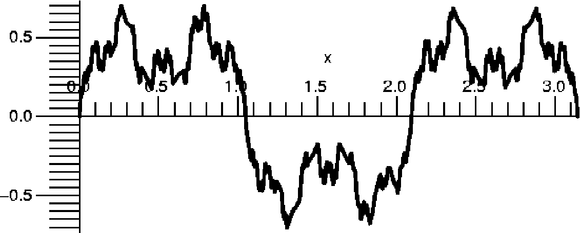 You can
contrast the Takagi function with one of the examples of Weierstrass,
much better known, which is a sum of sine functions (instead of
sawtooth functions). This example is add((1/2^j)*sin((3^j*x,j=1..N) (where we
imagine that the N is ∞). The picture to the right is a graph of
this function when N=30 on the interval [0,2π].
You can
contrast the Takagi function with one of the examples of Weierstrass,
much better known, which is a sum of sine functions (instead of
sawtooth functions). This example is add((1/2^j)*sin((3^j*x,j=1..N) (where we
imagine that the N is ∞). The picture to the right is a graph of
this function when N=30 on the interval [0,2π].
One further historical remark
Here is a quote from page 233, Scenes from the History of Real
Functions by Fedor Andreevich Medvedev, Springer 1991, which I
accessed through a
Google link.
By the beginning of the twentieth century the representatives of the
traditional view had begun to yield their positions, though not
completely. It was difficult to combat obvious facts and a curious
temporary exit was found. Functions having singularities ... came to
be regarded as annoying exceptions among the "good" functions, as
certainly pathological phenomena in the basically healthy body ... it
was even generously decided to study these diseased tumors ...
It turned out in the 1930's that this picture did not correspond to
the actual state of affairs. The class of continuous nowhere
differentiable functions turned out to be immeasurably richer than
the class of differentiable functions and it was rather functions of
the latter type that were "pathological". A curious situation arose,
when it turned out that the continuous functions that had been studied
by mathematicians for centuries, those that were used to describe the
phenomena of the external world, belong to a negligibly small class of
continuous functions.
More pictures
You can play with functions and summing and plotting and get many
strange pictures. Here:
> g:=x->frac(x)*(1-frac(x));
 This gets the top piece of a parabola on [0,1] and repeats it in every
integer interval. A picture of the graph on [-.5,1.5] is shown.
This gets the top piece of a parabola on [0,1] and repeats it in every
integer interval. A picture of the graph on [-.5,1.5] is shown.
 > Q:=(x,n)->add((1/3^j)*g((4^j)*x),j=0..n);
This adds up rescaled copies of g. The internal/external scalings in
the sum don't need to be the same. A graph of Q(x,10) on [0,1] is
shown.
|
Maintained by
greenfie@math.rutgers.edu and last modified 10/30/2008.